
Paywall layout and products
Adapty paywall builder simplifies the process of creating paywalls—specialized screens within your app where users can make purchases. This tool eliminates the need for technical expertise or design skills. You can effortlessly customize how your paywalls look, the messages they convey, and where essential buttons are positioned. What's more, you can even make real-time changes to these screens while your app is running — without App Store/Google Play reviews.
Moreover, Adapty empowers you to optimize your paywalls further with A/B testing. Alongside the paywall builder, this allows you to test different variations of your paywalls to find the most effective design and messaging. Whether you're striving to increase sales, promote content, or grant access to exclusive features, the paywall builder provides a user-friendly solution to accomplish these objectives.
In this section, we will discuss the customization of the layout and products of your paywalls.
Layout
After selecting the preferred layout type and corresponding template for your paywall in Adapty's paywall builder, you gain the ability to shape the visual appearance of your paywall, making it engaging and aligned with your brand's aesthetics. This tab offers a range of controls that allow you to customize various aspects of the paywall's layout, background, and appearance. Let's explore the controls and options available in the Layout tab:
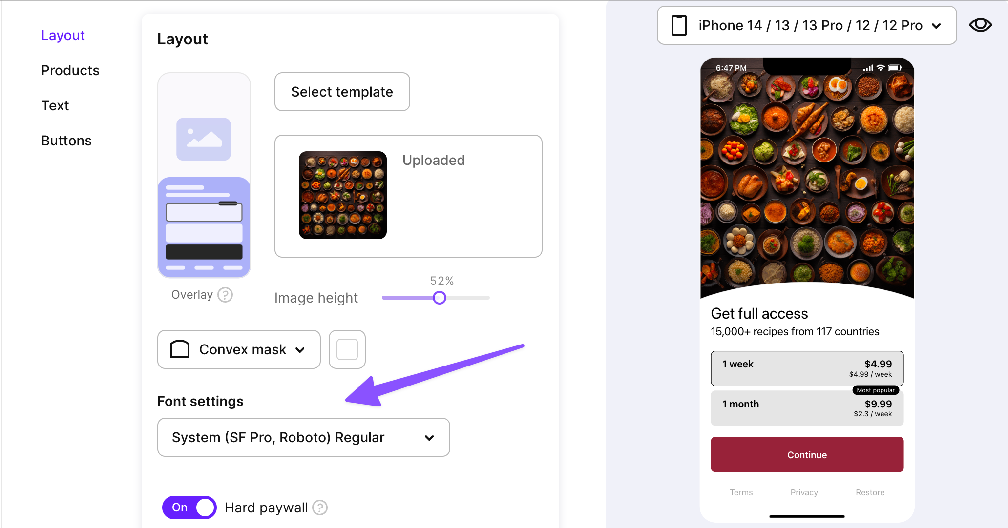
Main image and sizing
The main image is the centerpiece of your paywall's design, influencing the overall look and feel. This image serves to captivate users and encourage them to take action. Here are some guidelines to consider when selecting and uploading your main image:
- A photo should be PNG or JPEG < 2Mb.
- Photos with the main object in the center and some free space around it usually make the message clear.
- Emotional and/or bright photos work.
- Graphic works but use it without claims as there is a separate place for texts in the asset.
You have the ability to control the sizing of the main image, determining its proportions in relation to the entire paywall screen. This helps in achieving the desired visual balance and impact. Specify the image sizing as a percentage of the total screen area.
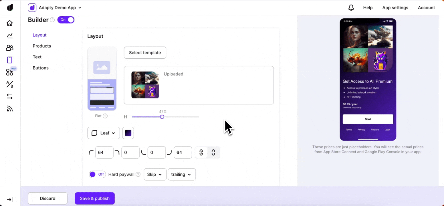
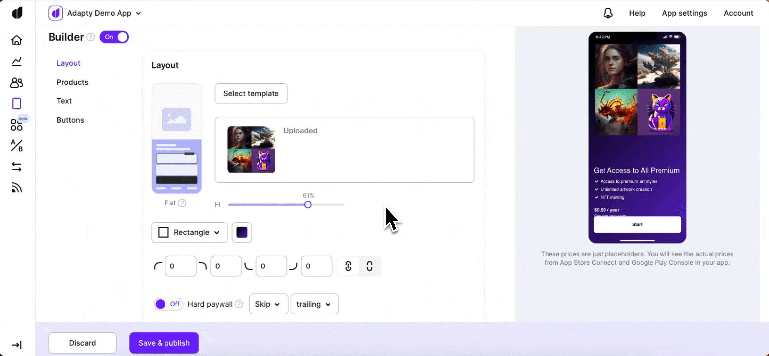
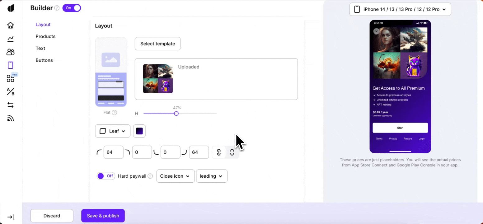
Mask type for the image
The mask type determines the shape of the main image, allowing you to apply creative effects to the visual presentation. Choose from the following mask types:
- Rectangle
- Rounded Rectangle
- Circle
- Leaf

You can adjust the roundness of the image mask using numerical values (not available for circle type).
Background color
The background color of the paywall sets the tone for the entire experience. You can choose a background color that aligns with your brand's identity or complements the image. The background color acts as a canvas that enhances the visual appeal of the paywall. You have the option to select either a solid color or a gradient color for the background.
Font settings of your paywall
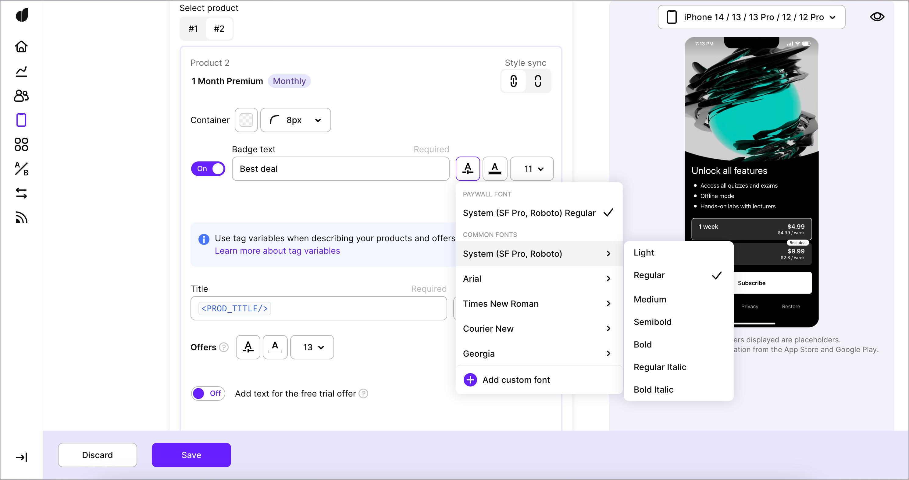
It's important to keep your paywall visually consistent with the rest of your app — and one of the biggest visual factors is the font that you're using. You can choose to simply have a system font for your paywall (SF Pro for iOS, Roboto for Android), use one of the available common fonts or upload your own custom font:
Changing the font settings in Layout affects all the other labels on the paywall (unless they have been customised before that).
You can learn how to upload your custom font here.
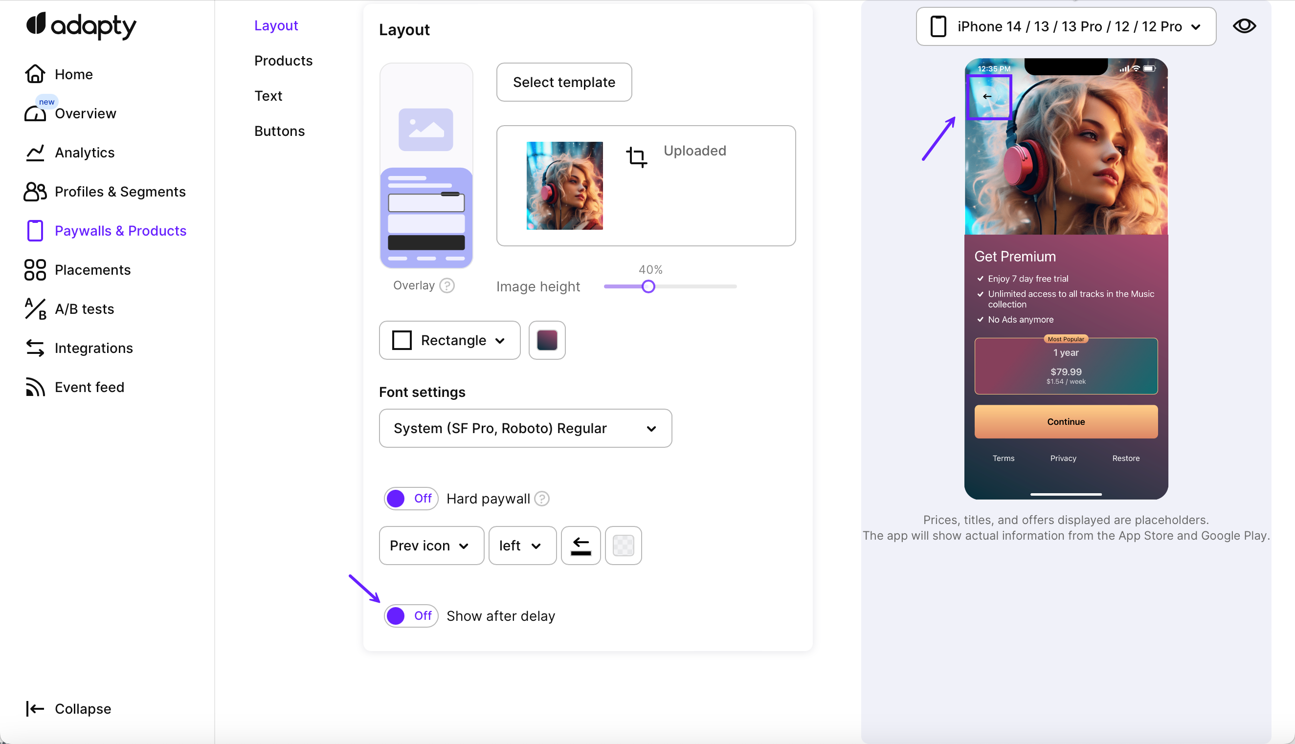
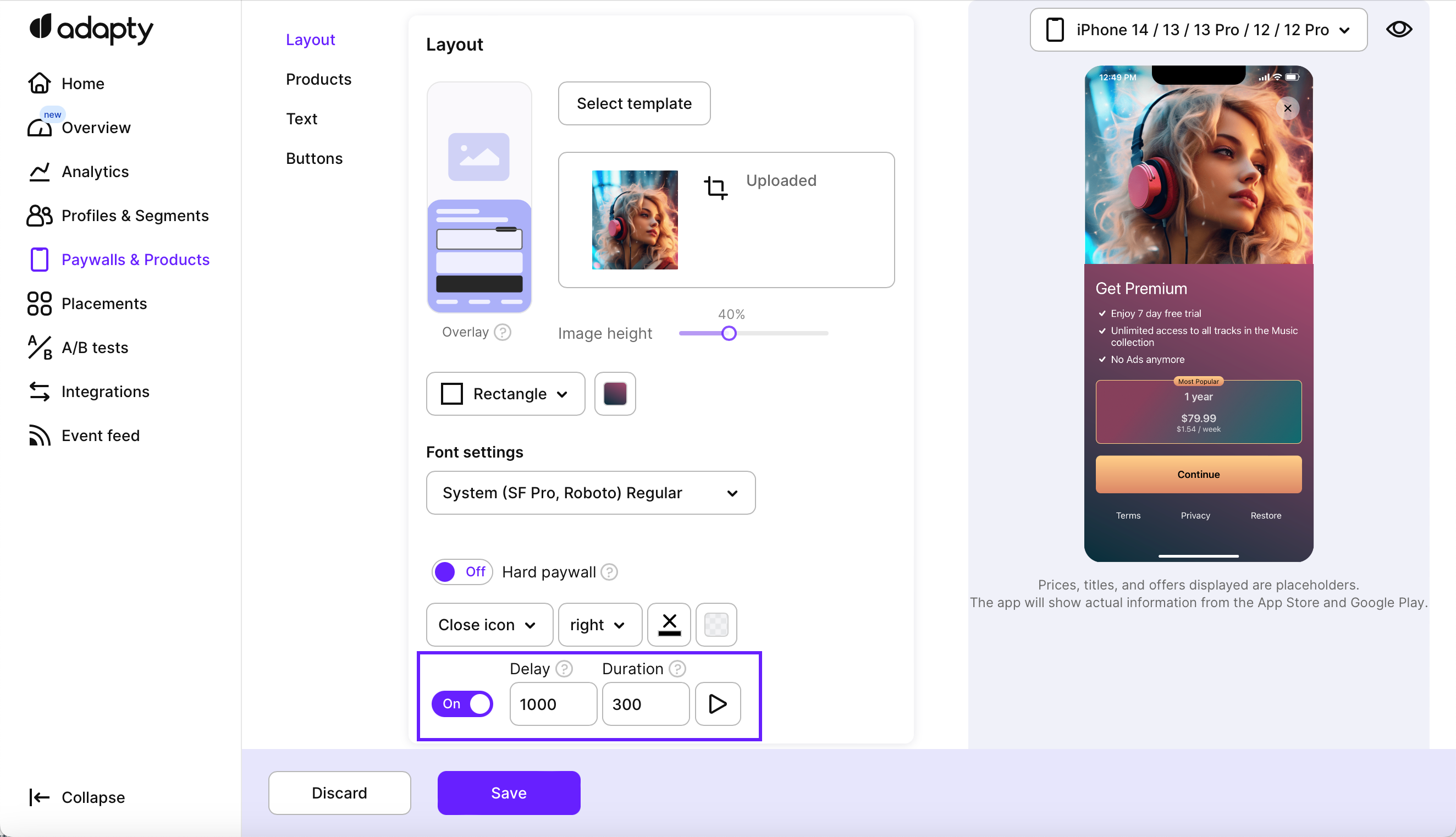
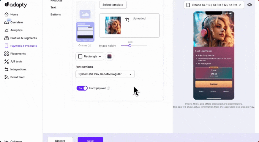
Hard and soft paywalls
A key decision you can make in the layout tab is whether to enable a closing button, resulting in a soft paywall, or to remove it, resulting in a hard paywall. By toggling the Hard paywall option, you can instantly see how the closing button adapts or disappears, based on your choice.
For soft paywalls, you can set up the view and behavior of the closing paywall button.
Close button, its style, placement and fade-in animation
The presence of the closing icon provides users with the means to dismiss the paywall and continue their interaction with the app.
For soft paywalls, you can define the view of the closing paywall button and how fast it will appear:
-
Switch off the Hard paywall toggle.
-
In the expanded section, pick how the button should look and where it should be. The preview on the right will instantly change to reflect your choice.
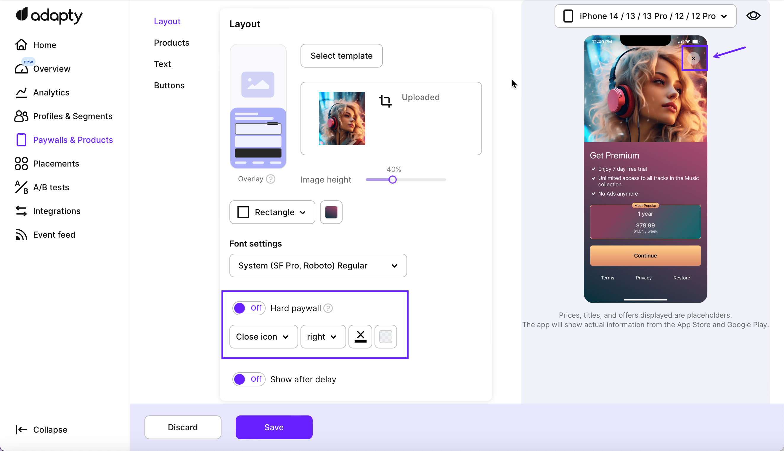
- Close icon type: Choose the icon for the Close button or Custom text for text buttons.
- Icon placement: Position the Close button either at the top-left, center or top-right part of the screen.
- Color and opacity: You can control the color and opacity of both the content and the background of the closing button. You can make the closing button fit your paywall better by adjusting the colors and/or removing the background of a button entirely.
- To add a delay before showing this Close button, switch on the Show after delay toggle.
-
In the expanded section, specify the delay duration (in milliseconds) before the Close button starts fading in and indicate how long the button's fade-in animation should last.
Here is a video to show the whole process:
Device compatibility preview
Use the drop-down menu above the asset to select different devices, providing a preview of how your layout will appear on various screens. This feature enables you to ensure that your paywall looks optimal across different devices and screen sizes.
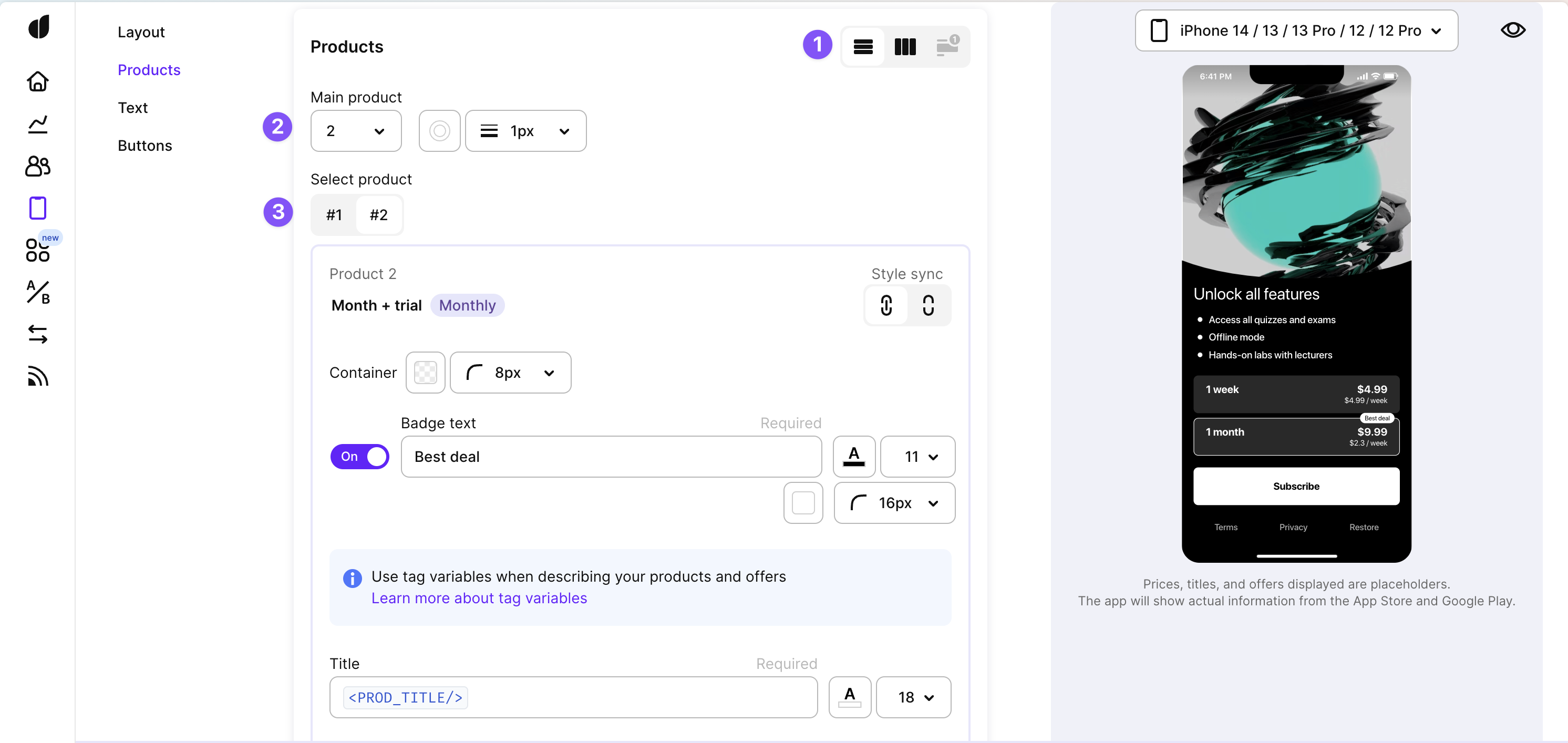
Products
In the products tab of Adapty's paywall builder, you have the ability to create and customize a visually appealing product section that showcases your offerings to users. This tab enables you to configure various aspects of the product's appearance and textual content. Let's delve into the options available for customization in the products tab:
Products tab
1. Product section layout
You can define how your product section is presented to users by choosing between a Horizontal List or a Vertical List layout. This layout selection influences how your products are arranged on the screen.
2. Main product
Highlighting a specific product can draw user attention. In the main product configuration, you can select the product that will be emphasized and preselected in the product section by a special border. This can be particularly useful for promoting a featured item or a special offer. You can also add badge text to this product to provide additional context or highlight its uniqueness — see how below.
3. Products customization
Let's take a look at how you can customize each product on your paywall:
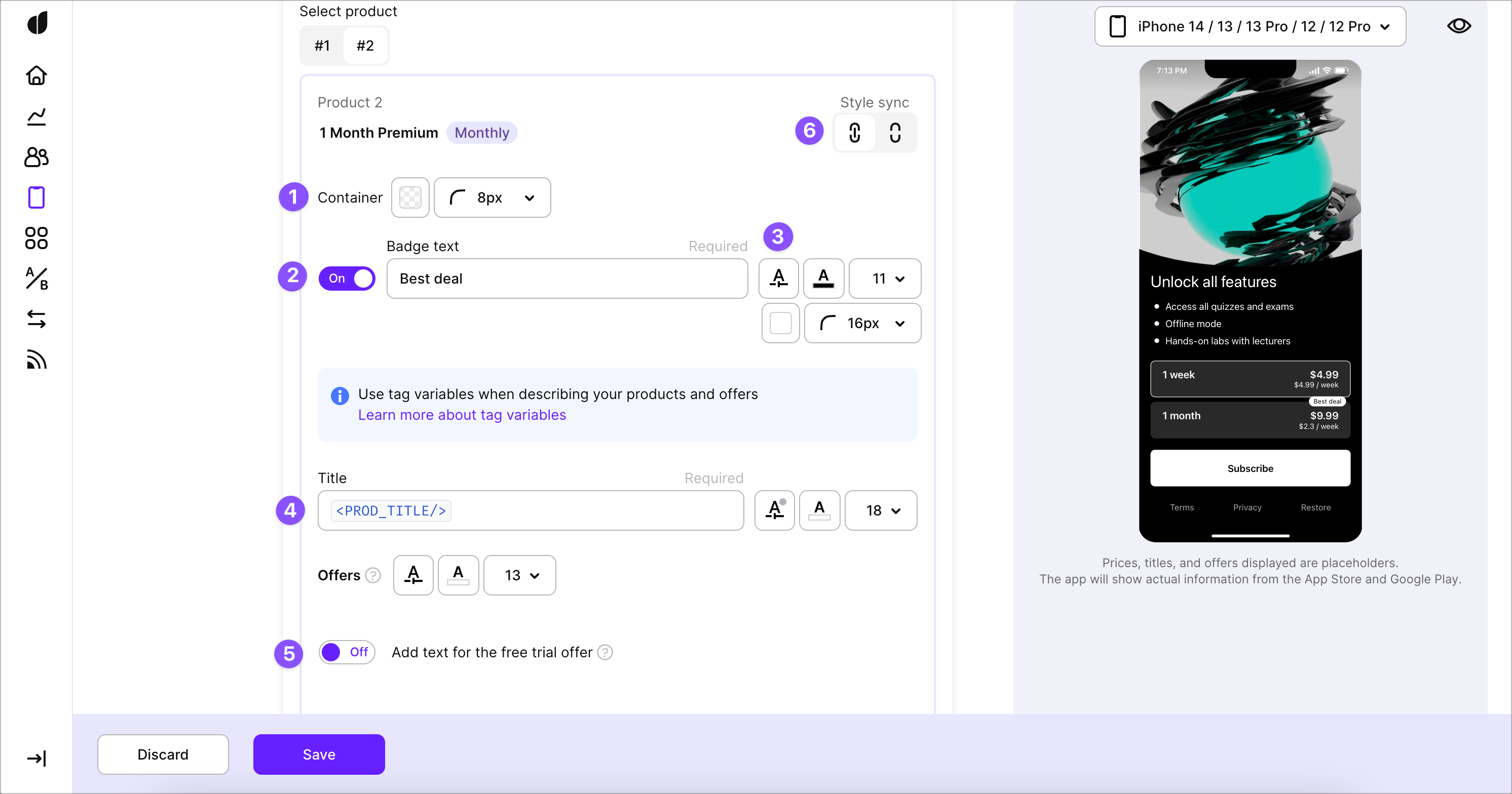
(1, 2) You can adjust the color and the corner radius of the product containers for a unique visual touch. And you can also have a badge for every product on a paywall to provide additional context such as the savings for the user or highlight its uniqueness.
(3) You can also control the font for each of the text labels — bold, italic or regular as well as upload your own custom fonts (learn more about it here):
(4) But what's probably more important is that you can describe your products in text and fine-tune text attributes such as size, color and style. You can also use optional second title and subtitle to provide more details — for example, to let people compare the pricing between products more easily. This level of control allows you to craft a visually appealing and informative product display within your paywall, optimizing the user experience.
Using tag variables
Every text field in the product block supports tag variables such as
<PROD_TITLE/>for the title of the product. We strongly recommend using them for easier localization.
(5) If you intend to use this paywall in cases where a user might be eligible for an offer, you should configure the offer text for every expected type. And of course you can adjust its color and size as well. If a user is found eligible — the corresponding offer text will be shown as a subtitle on the product card.
Default text for offers
Note: eligibility for an offer is determined on a device by SDK. In case you haven't provided a custom text for it and the user was found eligible — our SDK will show a default text corresponding to the offer type.
Learn more about offers here.
Product styles: synced or separate
By default changing each of the style components above (such as any color, font size, or corner radius) applies to all of the products on a paywall. But if you want to make a particular product pop, you can disable the Style sync for this product and tune its visuals separately. This can be especially useful when highlighting the main product.
You can disable Style sync for a product in the upper right corner. After that, any changes you make to the visuals will only be applied to this product:
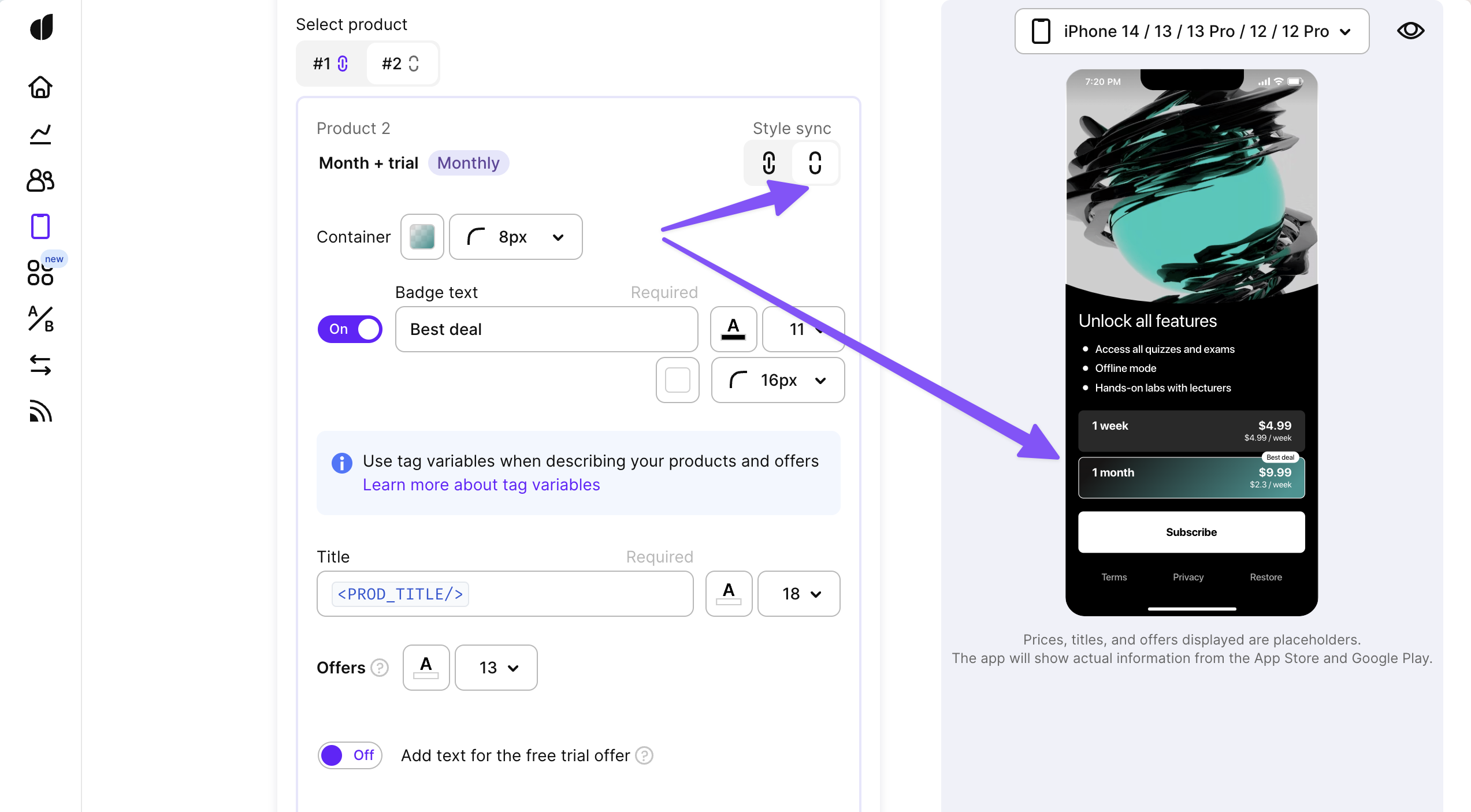
You can use this control to style any one of your products separately from the rest. But remember: when you turn style sync back on after making changes — this will revert them, so be careful.
Style sync also doesn't affect texts as those are always separate for every product.
Preview products on your Paywall
Once you've finished customizing how your products look, it makes sense to double-check the result using preview before testing it on a device. You can find some useful settings for it in the "eye" icon in the top-right corner:
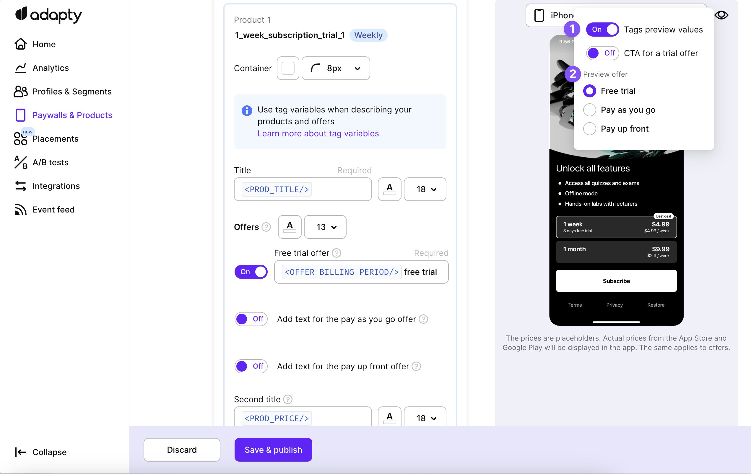
There you can toggle whether you'd like to see our placeholders for the tag variables or the actual values of the tags. Or you can simulate what the paywall will look like if a user is found eligible for a certain offer type.
Preview uses placeholder values for tag variables
Remember: if you use tag variables for your products, the Preview only shows some hardcoded placeholder values for them. This is applied both to prices and titles for both the products and offers. The actual values will be retrieved from the App Store and Google Play and shown only on the device.
Updated 10 days ago