
Analytics controls
Controls, filters, grouping, compare and proceeds that make data informative.
Adapty offers a wide range of controls to help you gain valuable insights and unlock the full potential of your data and gain a comprehensive view of your business performance. Whether you're analyzing charts, cohorts, funnels, retention, conversion data, or LTV, these controls provide powerful functionality. By leveraging these controls, you can dive deeper into your data and extract meaningful insights to drive your business decisions.
In the following article, you can learn more about each control and how to use them effectively. Additionally, you'll find information about which controls are supported for each type of analytics, including charts, cohorts, funnels, retention, and conversion.
| Control | Charts | Cohorts | Funnels | Retention | Conversion | LTV |
|---|---|---|---|---|---|---|
| Time ranges | ✅ | ✅ | ✅ | ✅ | ✅ | ✅ |
| Data comparison | ✅ | ❌ | ❌ | ❌ | ❌ | ❌ |
| Filtering | ✅ | ✅ | ✅ | ✅ | ✅ | ✅ |
| Grouping | ✅ | ✅ | ✅ | ✅ | ✅ | ✅ |
| Chart views | ✅ | ❌ | ❌ | ❌ | ❌ | ❌ |
| Table view | ✅ | ✅ | ✅ | ✅ | ✅ | ✅ |
| CSV data export | ✅ | ✅ | ✅ | ✅ | ✅ | ✅ |
| Proceeds | ✅ | ✅ | ❌ | ❌ | ❌ | ✅ |
| Taxes | ✅ | ✅ | ❌ | ❌ | ❌ | ✅ |
Time ranges
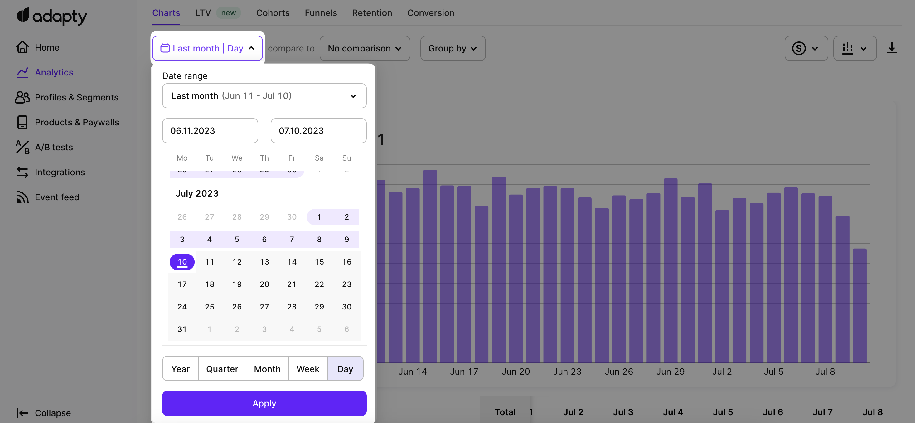
When using the Adapty calendar to set a time range for a chart, you have several convenient options to choose from. These options determine the date range displayed on the x-axis of the charts, allowing you to focus on specific periods of time. Here are the available quick options for time ranges:
- Last 7 days: Displays data for the most recent 7-day period.
- Last month: Shows data from the current date to the same day in the previous month.
- Last 28 days: Useful for tracking weekly subscription products, as it covers the last four weeks.
- Last 3 months: Displays data from the current date to three months ago.
- Last 6 months: Shows data from the current date to six months ago.
- Last year: Displays data from the current date to one year ago.
- Previous month: Covers the full calendar month before the current month.
- This month: Shows data from the 1st day of the current month until today.
- This quarter: Displays data from the 1st day of the current quarter until today.
- This year: Covers data from the 1st day of the current year until today.
In addition to these predefined options, you can also select the Custom option to set a specific time period of your choice. This flexibility allows you to analyze your data in more granular detail or focus on specific events or campaigns.
Apart from selecting specific time ranges, you can also adjust the time scale of charts. By choosing a day timescale, you can view the most detailed level of data, while opting for lower resolutions such as week, month, quarter, or year, allows you to identify longer-term trends.
For charts, the time scale determines the scale of the grid on the x-axis and the resolution at which the data is displayed. The available time scale options include day, week, month, quarter, or year. Choosing a specific time scale allows you to view the data at different resolutions, helping you identify shorter-term or longer-term trends.
When analyzing cohorts in Adapty, you choose the cohort length, which determines the size of each cohort and the grouping of users based on a specific time period. The time frame in cohorts analysis refers to the duration for which you want to analyze user behavior, and it helps define the boundaries of the cohorts.
In LTV (lifetime value) analysis, the cohort length is chosen in the grouping settings and determines the time period over which you want to calculate the lifetime value of users. Similar to cohorts analysis, the cohort length in LTV analysis is independent of the time frame displayed on the x-axis of the charts.
We have 2 formats of date and time - American and European. You can set one of them in your Adapty account as described here.
Date filtering for charts
Please also note that all charts in Adapy analytics are displayed in UTC time.
Data comparison
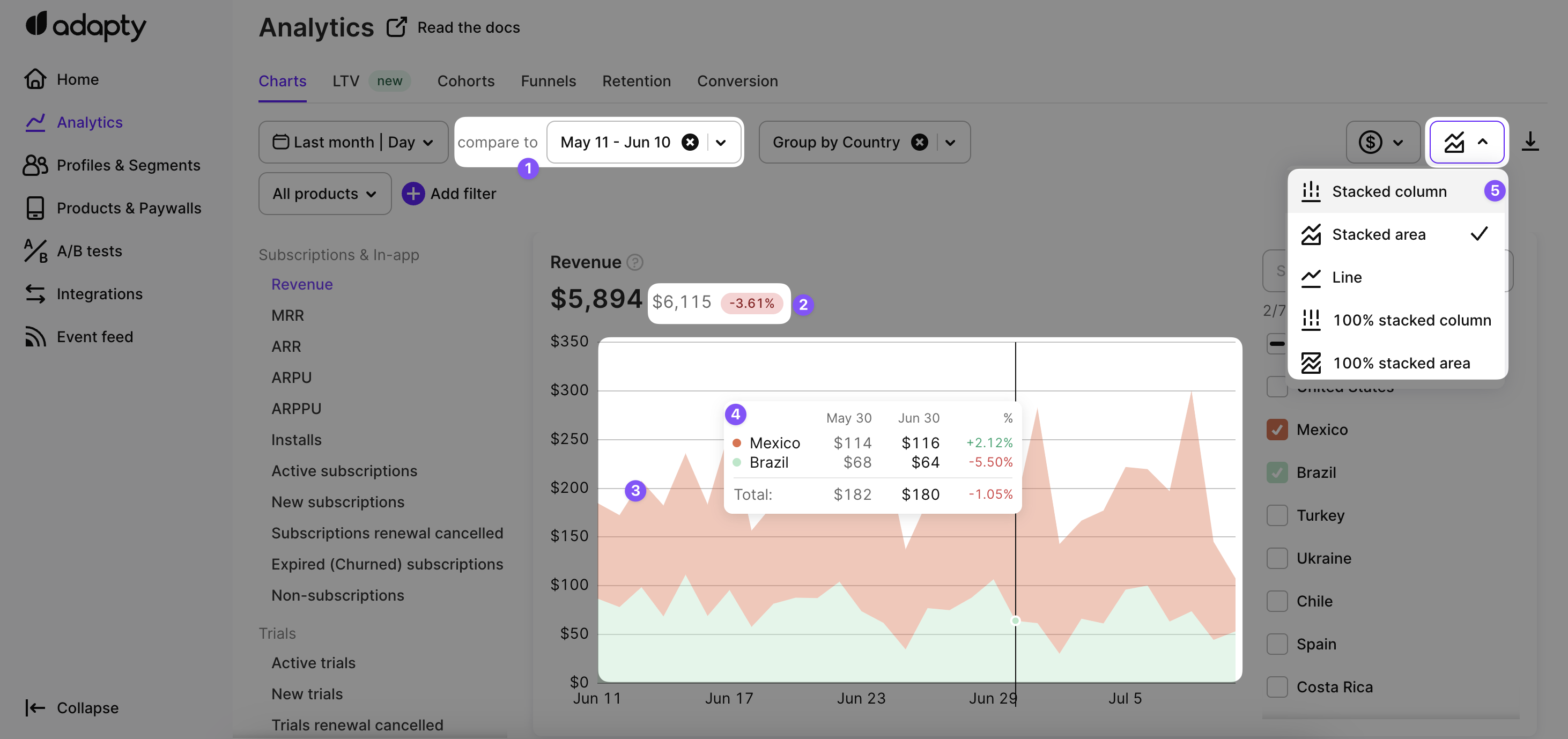
To analyze the dynamics of your app's metrics, you can utilize the comparison feature located next to the calendar. It offers a convenient way to compare your metrics with the previous period, although you also have the flexibility to customize the comparison range based on your specific requirements.
Here's how you can interpret the insights provided by the comparison feature:
- Comparison Display: After selecting the comparison period, you can toggle between displaying the comparison on the chart or as a numerical value only.
- Difference Indicator: The comparison shows the variance between your current result and the result from the previous period. Higher values are indicated in green, while lower values are indicated in red.
- Chart Visualization: If you have no grouping or only one grouping selected, the comparison will be displayed on the chart as well. You can choose from different chart types such as area, line, or column to visually highlight the differences.
- Detailed Tooltip: Hovering over the chart will reveal a tooltip with additional details, allowing you to examine the specifics of the comparison.
- Multiple Grouping and Comparison: If you have multiple grouping options enabled, you can view multiple comparisons simultaneously on a single chart. This feature is available specifically for column charts.
See the comparison on a chart or just as a number
Filtering and grouping
Filters play a crucial role in refining the data displayed in charts by including only the information that matches specific attributes. This feature becomes especially handy when you wish to examine the performance of a particular property, such as a specific country or product identifier.
By grouping chart data, you can analyze the individual components that make up the chart totals. This is particularly valuable when you want to evaluate the performance of particular properties.
It's important to note that certain charts may not support every type of filtering or grouping. To determine the compatibility of filters and grouping options with each chart, you can refer to the corresponding information provided on the respective chart description page.
In Advanced Analytics, you have access to the following filtering and grouping options, empowering you to refine your data analysis:
| Filtering | Grouping | Description | |
|---|---|---|---|
| Attribution | ✅ | ✅ | Filter or group metrics by Attribution fields like Status, Channel, Campaign, Adgroup, Adset, and Creative. |
| Renewal Status | ❌ | ✅ | Group metrics by the product's renewal status, which indicates whether or not the subscription will be renewed in the next period. |
| Period | ❌ | ✅ | Group metrics by the period. |
| Country | ✅ | ✅ | Filter or group metrics by user's store country (if available, otherwise country is inferred using currency code or device's IP). |
| Paywall (Deprecated) | ✅ | ✅ | Filter or group metrics by paywalls that are associated with purchases. ( Deprecated legacy option) |
| Paywall | ✅ | ✅ | Filter or group metrics by paywalls that are associated with purchases. |
| A/B Test | ✅ | ❌ | Filter or group metrics by A/B teststhat are associated with purchases. |
| Placement | ✅ | ✅ | Filter or group metrics by placementthat are associated with purchases. |
| Store | ✅ | ✅ | Filter or group metrics by store (iOS/Android). |
| Product | ✅ | ✅ | Filter or group metrics by product (both subscriptions and one-time purchases are available). |
| Duration | ✅ | ✅ | Filter or group metrics by product's duration. |

Filtering and grouping options
Chart views
The Analytics section provides you with the flexibility to view each chart in different visual representations, such as stacked column, stacked area, line, 100% stacked column, and 100% stacked area. By selecting the appropriate view, you can effectively communicate the information displayed on the chart and enhance your data analysis experience.
To change the view of a chart, simply locate and select the view dropdown menu, and then choose the desired representation option
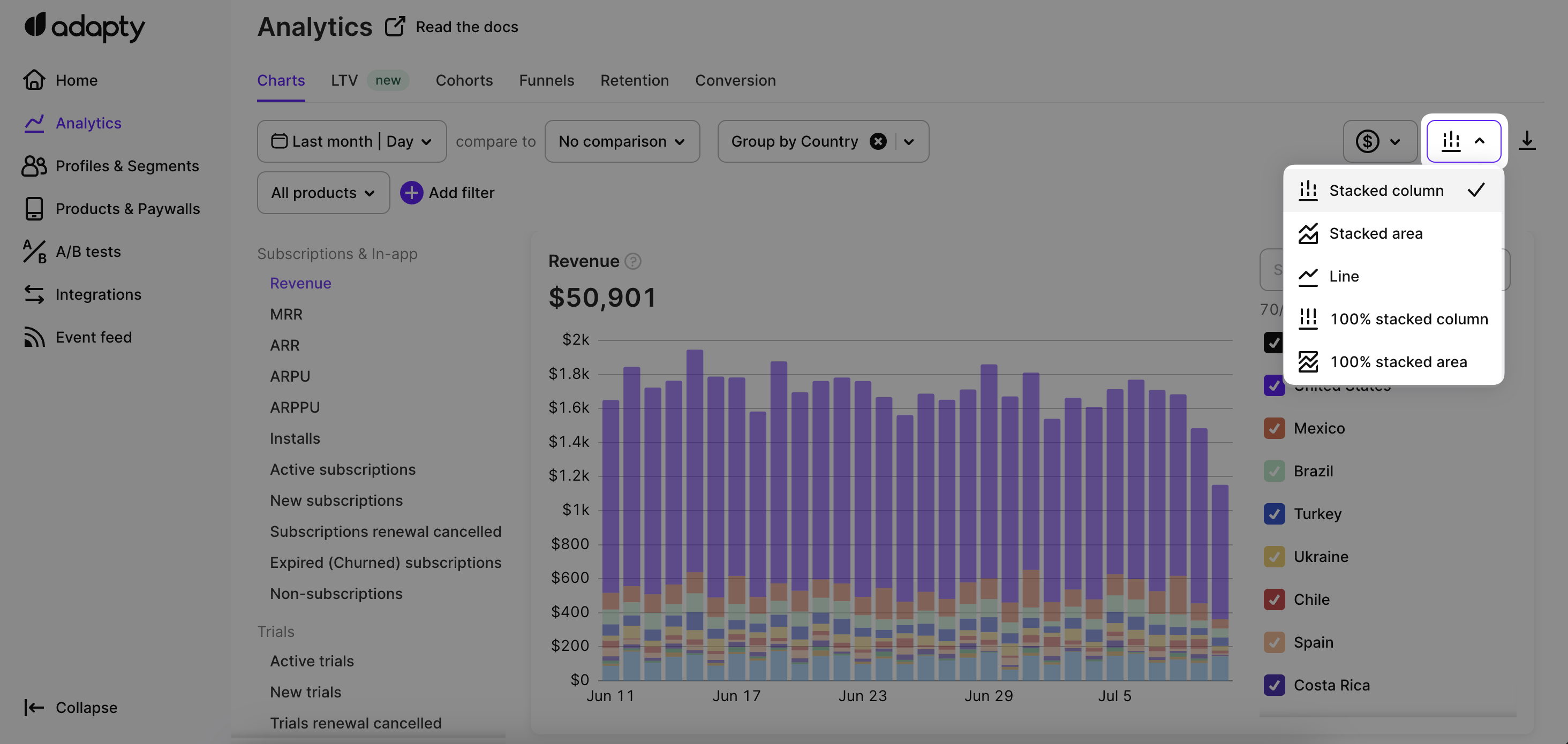
Chart views
Table view
In addition to the chart view, Adapty also provides a table view for each chart. The table view presents the underlying data used to generate the chart in a tabular format, allowing users to view and analyze the data in a more granular way. The table view is a useful tool for users who prefer to work with data in a more structured format or need to export the data for further analysis outside of Adapty.
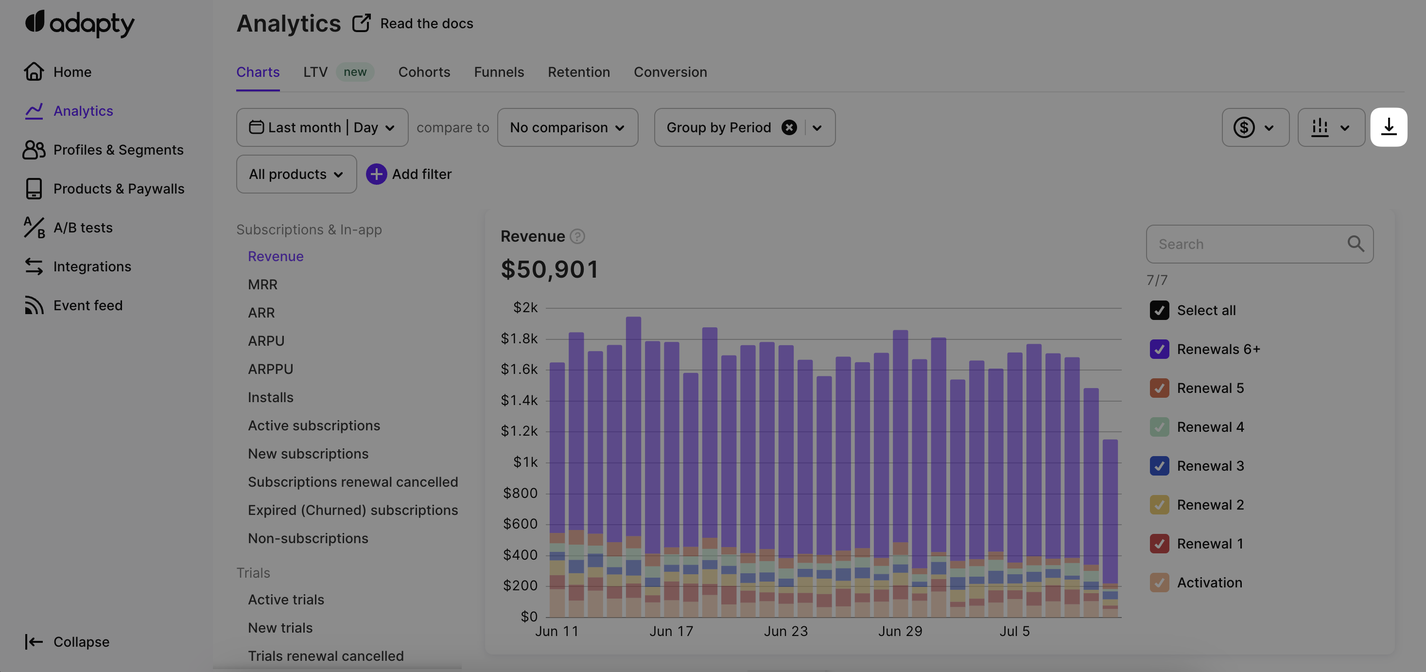
CSV data export
If you want to analyze the underlying data used to generate a chart, cohorts analysis, funnels, retentions, or conversion analytics, you can easily export it in CSV format by clicking the Export button. This feature allows you to access the raw data used to create the respective analysis. You can manipulate this data in spreadsheet applications or other tools to perform further analysis.
Exporting chat data in .csv format
Store commission and taxes
One crucial aspect of revenue calculation is the inclusion of taxes (which can vary based on the user's store account country) and store commission fees. Adapty currently supports commission and tax calculation for both App Store and Play Store.
In the charts tab of the Analytics section, Adapty introduces a dropdown field with three display options.
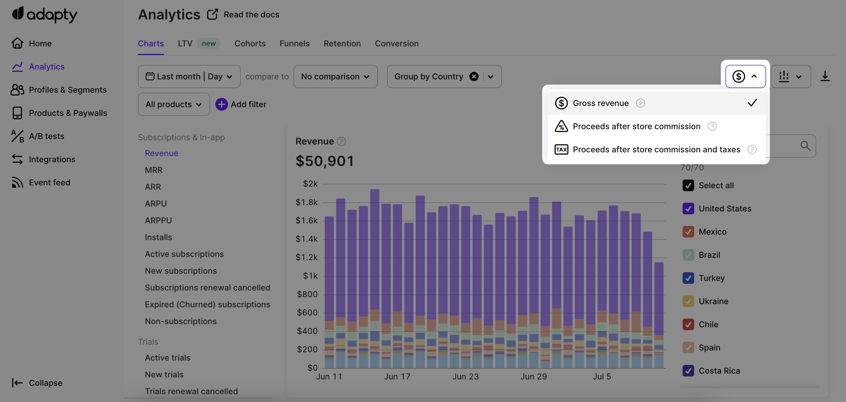
Store commission and taxes controls
The dropdown allows you to choose how the revenue is displayed in the chart. The available options are as follows:
Gross revenue
This option displays the total revenue, including taxes and commission fees from both App Store / Play Store. It represents the complete revenue generated by transactions before any deductions.
Proceeds after store commission
This option displays the revenue amount after deducting the store commission fee.
It represents the revenue that remains after the App Store / Play Store cuts its commission fees from the gross revenue. Taxes are not deducted in this display option.
Apple and Google take up to 30% of the price paid by the customers as a fee. For the apps included in Small Business Program (i.e. the app makes less than $1m per year), the fee is always 15%. The rest of the apps (>$1m per year) pay 30% by default and 15% for subscriptions that are consecutively renewed for at least a year. For detailed information on how Adapty calculates store commission fees, please refer to the corresponding documentation for App Store and Play Store.
Proceeds after store commission and taxes
This option displays the revenue amount after deducting both the store commission fee and taxes.
It represents the net revenue received by the app after accounting for both store's commission and applicable taxes. We consider the VAT rate of the user's store account country when calculating taxes. Please consider that Adapty follows the logic that for Apple taxes are applied to the post-commission revenue from a transaction, while Google applies taxes to the full amount (before store commissions are reduced from the revenue).
It's important to note that this revenue dropdown applies to various revenue-related charts, such as Revenue, MRR (Monthly recurring revenue), ARR (Annual recurring revenue), ARPU (Average revenue per user), and ARPPU (Average revenue per paying user). These charts provide valuable insights into revenue-related information for your app.
Updated 12 days ago