Retention analysis
As a marketing target retention is usually cheaper than acquisition for high-quality contact. So treat your subscribers wisely and maintain retention levels for your product range. Select duration, country, attribution, and other filters for deeper retention insights.
Retention charts can help with the following questions:
- How does your app retain clients from period to period?
- What products are more attractive and hold better?
- What groups of users are more loyal?
- Which level of retention can be used as a benchmark for growth?
- And of course, how can you save money investing in the attracted audience instead of capturing new.
You'll find valuable insights about user behavior setting filters and groups.
Retention is performed with the data that we gather through SDK and store notifications and don't require any additional configuration from your side.
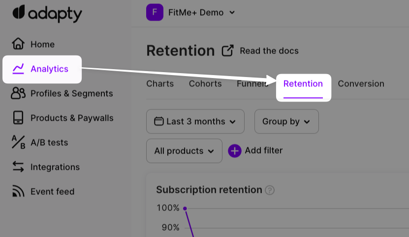
Retention is a part of the analytics section
How do we calculate retention?
Observing the retention chart, you see how the number of users depends on the step they take: trial (if the checkbox "show trials" is checked), the 1st payment, the 2nd payment, etc. Let's specify what users are counted when you choose a date range for the retention chart.
For example, you've selected the last 3 months in the calendar, and the checkbox "show trials" is unchecked. This means we count only those who have had their 1st subscription during the last 3 months. If the checkbox "show trials" is checked and the 3 last months are selected in the calendar we count all those who have had their trials during the last 3 months. For these subscribers, we show the absolute retention for the Nth step as the number of those who have had the Nth payment. And we calculate a relative value of retention for the Nth step as a ratio of the absolute amount of the Nth payment to the total amount of subscriptions (or trials) during the selected time range.
Retention changes retrospectively
Regardless of when you check the chart, the baseline number (100%) remains the same for the selected period of time. Meanwhile, the retention to the next period may grow over time.
For example, for a Monthly subscription, if there are 20 first purchases made between Dec 1 and Dec 31, it is expected that retention to the second period will grow throughout January (and possibly even after) while users will be entering the next subscription period in time or later for some reasons (e.g. grace period).
Retention opportunities
Let's see how to get more from the Adapty retention feature.
Having not only a pure passion for numbers but more willingly seeing real business value after implementing analytical results, we may think about the purposes first. With a deep dive into chart features, it would be nice to clear up the impact this data can have.
So let's keep in a glance together WHY and HOW.
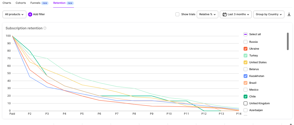
An example of a retention chart
1 - work with the audience.
First of all, retention is about the target audience, its preferences, and whether your product meets their expectations or not during the consuming lifetime. If you have wondered how to measure the core relationship of your business that generates money - retention is at your service.
Such a measurement benefits because it's usually cheaper to sell to your customer than to a stranger. And this cost is low for two reasons: less effort to sell and higher average check. So it might be a good idea to invest in your subscribers' loyalty when retention goes down.
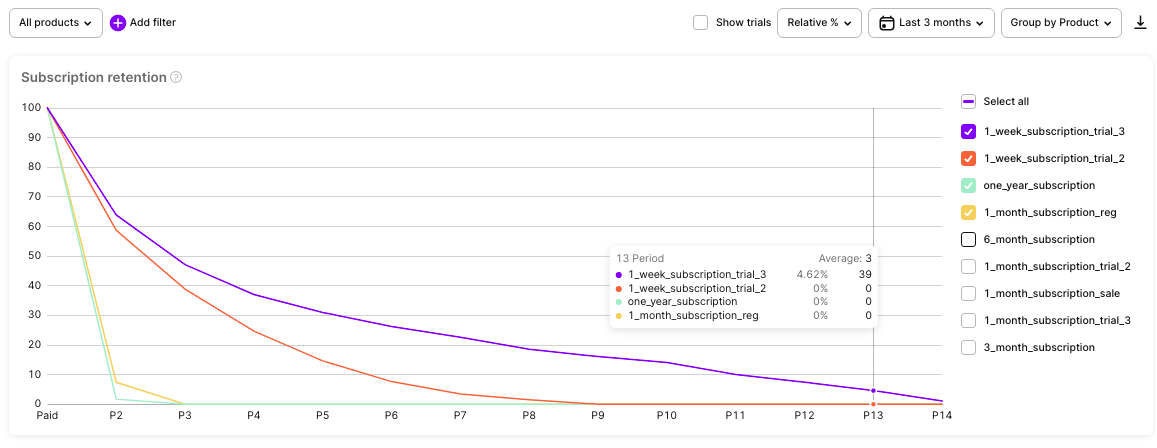
A weekly subscription here retains through the year better than monthly and annual products. It would be nice to encourage retained users at the beginning of their 2nd year
2 - work with the product.
The second reason WHY is that retention charts show the actual consuming lifetime of your product and let you forecast in long term. And if you want to improve, correct the job that delivers the product to change its lifetime, and then forecast again to become closer to your business targets. Such updates may be a part of a strategic vision working together with a forecasting routine. And yes, this process never ends because we all run fast to be at the same place in a constantly changing environment.
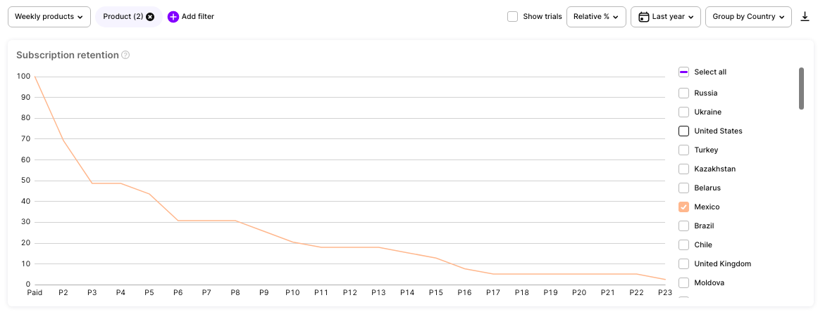
Some products have several "plateau" levels of retention. It's flat, then something changes and the product becomes less needed. Such steps contain possibilities for in-time updates.
3 - work with the market.
Moving faster than the main competitors is good but sometimes jumping out of the ordinary race may bring more benefits. When you analyze the behavior of users in different countries and stores, some local peculiarities can open outstanding insights and new opportunities for the business. Cultural and market context can be analyzed from the perspective of retention to be later used for segmentation and further development. For example, you may find blue water in some regions and grow there faster.
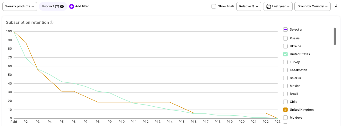
US and UK users here show different behavior. While the US ones constantly lose interest and need something new or else, the UK has flat periods of stable retention which reveals other local patterns of usage.
The usage of retention data is of course, not limited to this basic interpretation but it may be a good start if you want to get real value fast.
Curves, table view, filters and CSV export
Now when we are on the same page with retention purposes and basic ways of interpretation let's go through the tools that make it all handy.
The core of the retention feature in Adapty is the chart. It shows how retention level depends on the steps of a customer's lifetime.
The steps are shown on the horizontal axis: Trial, Paid (the 1st subscription), P2 (the 2nd subscription), P3, P4, etc
Please mind that the axis starts with the Trial step only when the checkbox "Show trials" is selected.
For data calculation, this checkbox works as follows. When "Show trials" is selected and the axis starts with the Trial step, you see only scenarios that contain trials, no transactions directly from installs are shown and the step Paid contains only transactions that come from trials. When "Show trials" is not selected, and the axis starts with a Paid step, this first step contains all first transactions including both from trials and directly from installs.
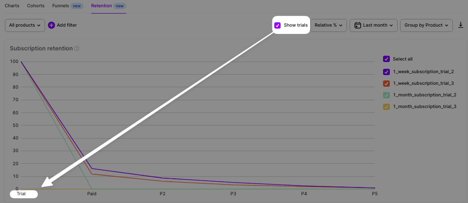
Change the 1st step with the checkbox
When you hover over the chart, a pop-up with a data summary is displayed. And if you hover over a column in the table below, you also see a summary pop-up with relevant data on the chart.
The table contains the same grouping and filters chosen for the chart.
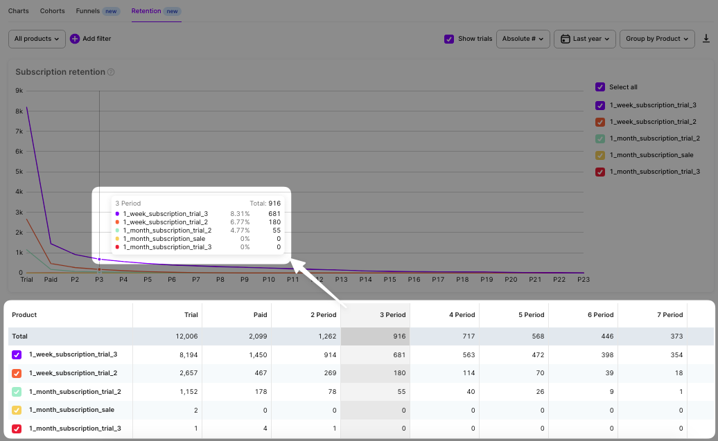
Find a table below a retention chart
Feel free to combine filters and grouping for advanced analysis. Collect true insights based on data.
Variate:
- Product type.
- Duration.
- Time range.
- Country.
- Traffic attribution.
- Store.
Use #Absolute and %Relative control to view the necessary data.

Go into deeper analyses with filters and other settings
Finally, on the right of the control panel, there's a button to export funnel data to CSV. You can then open it in Excel, or Google Sheets, or import it into your own analytical system to continue analysis and forecasting in your preferred environment.
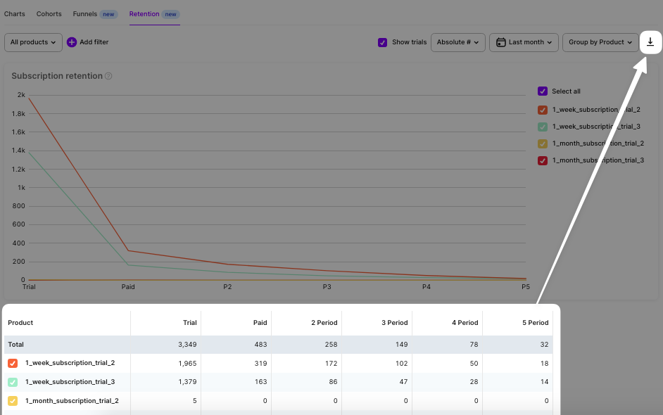
CSV export
Be sure to indicate that your app is included in Small Business Program in Adapty General Settings.
Updated 9 days ago