
Cohort analysis
Understand how much money you collected from customers from a specific cohort. You can also see subscription retention in cohorts and compare it using attribution, country, and other filters
Adapty cohorts are designed to answer several important questions:
- On what day does a cohort pay off?
- How much money does the app earn for a specific cohort?
- How much money can I spend to attract a paying customer?
- How long does it take to recoup the ad spend?
Cohorts work with the app data we gather through SDK and store notifications and don't require any additional configuration from your side.
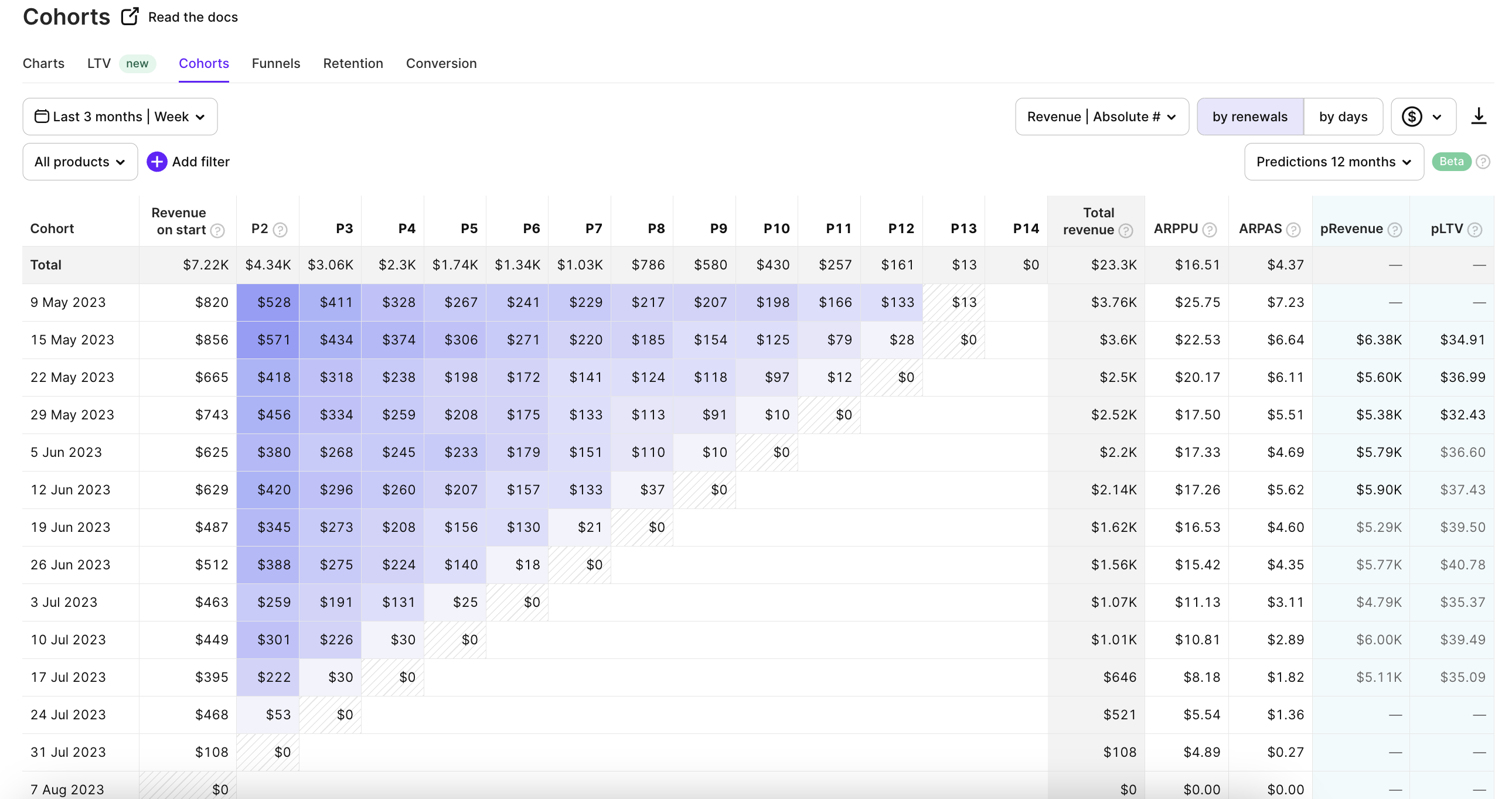
Weekly cohorts with absolute data for weekly products shown by renewals.
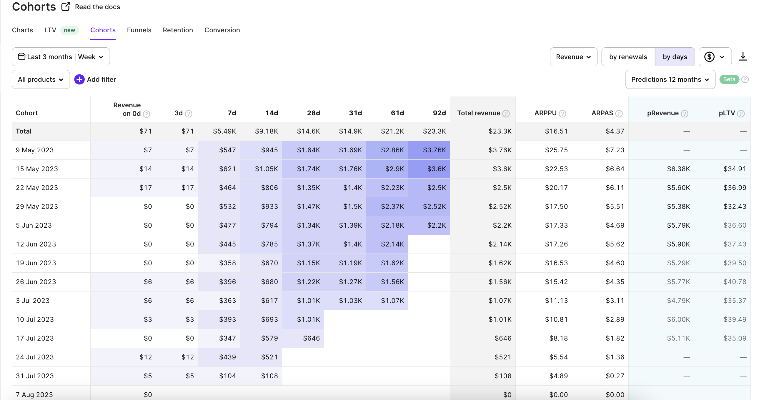
Monthly cohorts for products with trials shown by days.
Cohorts by renewals or by days
You can analyze cohorts by renewals or by days. The control changes the headings of the columns. Consequently, the approach to analysis also changes.
Tracking by days provides valuable insights for budgeting and understanding payment timelines. This is which is particularly useful for tracking non-subscription products, such as consumables or one-time purchases. In this mode, the blue color in the table cells tends to be concentrated in the middle of the lines due to two key factors. Firstly, viewing cohorts by days allows for early visibility of payments associated with short duration products, while in the renewals view, they are grouped with monthly and yearly renewals. Secondly, delayed payments contribute to the distribution pattern, as some users pay later than expected.
Whereas tracking by renewals shows the retention and churn of the cohorts from one payment to another without consideration of the date. So late users who paid with any delay (it can be months) are added to the number of their subscription period. This approach doesn't reflect the situation of calendar earnings but is definitely more convenient to analyze the retention and churn of the cohorts and get insights from their behavior.
Choose your convenient mode or use them both for more conclusions and ideas.
Analyze cohorts by renewals or by days
How Adapty builds cohorts
Let's see in the example of cohorts by renewals how the table is formed. To build cohorts, we use two measures: app installations and transactions (purchases). Every row of a cohort represents a specific time interval: from a day to a year. Each row starts with the number of users who installed the app during this interval and activated a subscription or made a lifetime/non-subscription product purchase.
Every next column in the row shows the number of users who renewed a subscription to this period. M3 stands for month 3 and means that subscribers had 3 consecutive renewals to this point, W7 stands for week 7, and Y2 stands for year 2. Sometimes you can see P2 in cohorts. P stands for Period of subscription. Adapty displays instead of W/M/Y when there are multiple products with different renewal periods present in the same cohort.
We use gradient colors to highlight differences in cohort values. The biggest numbers have more saturated colors.
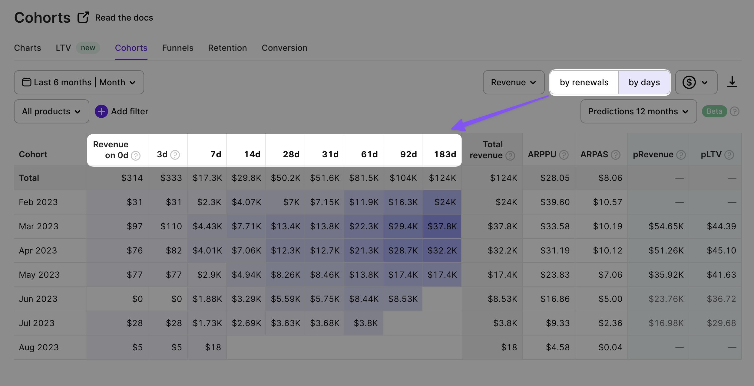
In the image below you can see a typical cohort.
- This cohort displays the data only for weekly products (mark #1).
- It doesn't exclude proceeds and shows the revenue as absolute values (mark #2).
- The time period we're working with is the last 6 months, and every cohort segment is 1 month long (mark #3).
- The Total row (mark #4) displays the cumulative value for each period. $23,5K in the first cell of the Total row accumulates the first period (subscription activation) revenue from all months (Feb, Mar, and so on) until the end of the timeframe.
- The first column of the Feb 2023 row (mark #5) shows the first period (subscription activation) revenue of $3.26 from the customers who installed the app in Feb 2023. The second column of the Feb 2023 row shows week 2 (subscriptions renewed to the 2nd week) revenue of $2.29 who installed the app in Feb 2023.
- On the table you can see Total revenue, APPPU, and ARPAS (mark #6). You can read more about them a little further in this article.
- Above the table on the right (mark #7), there is also a dropdown field to calculate stores' commission fees and taxes calculation for the specific cohort analyses. You can learn about how Adapty calculates store commission fees and taxes further in this article. After choosing the corresponding option from the dropdown the revenue data will be recalculated based on it.
- On the right side of the table you can see predicted revenue (pRevenue) and predicted lifetime value (pLTV) (mark #8). The pRevenue field estimates the total revenue generated by a subscriber cohort within a specific timeframe, while the pLTV field represents the anticipated value of each user in the cohort.
How to read cohorts' table
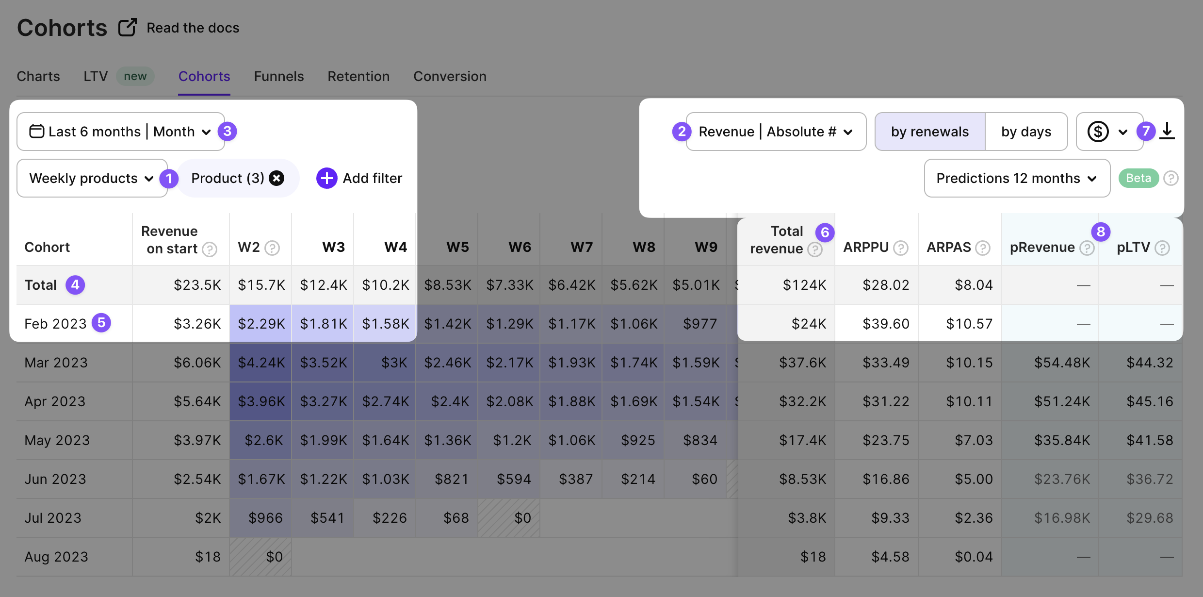
You can hover on any cell in the cohort to view detailed metrics for this period.
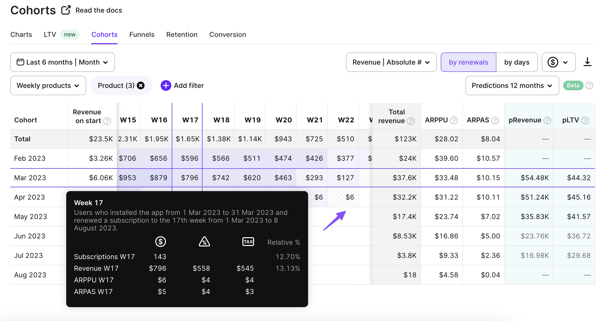
An overview is provided for each cell
The cells with oblique lines in the background are the periods that are not finished yet, so the values in them might be increased.
Filters, metrics, cohort segments, and export in CSV
Adapty offers a wide range of controls to help you gain valuable insights when looking into your cohorts' analyses. By default, Adapty builds cohorts based on the data from all purchases. It might be useful to filter all the products of the same duration or specific products. You can also use country, store, paywall, segment, and attribution data as a filter. You can find more information about the available controls, filters, grouping options, and how to use them in this documentation.
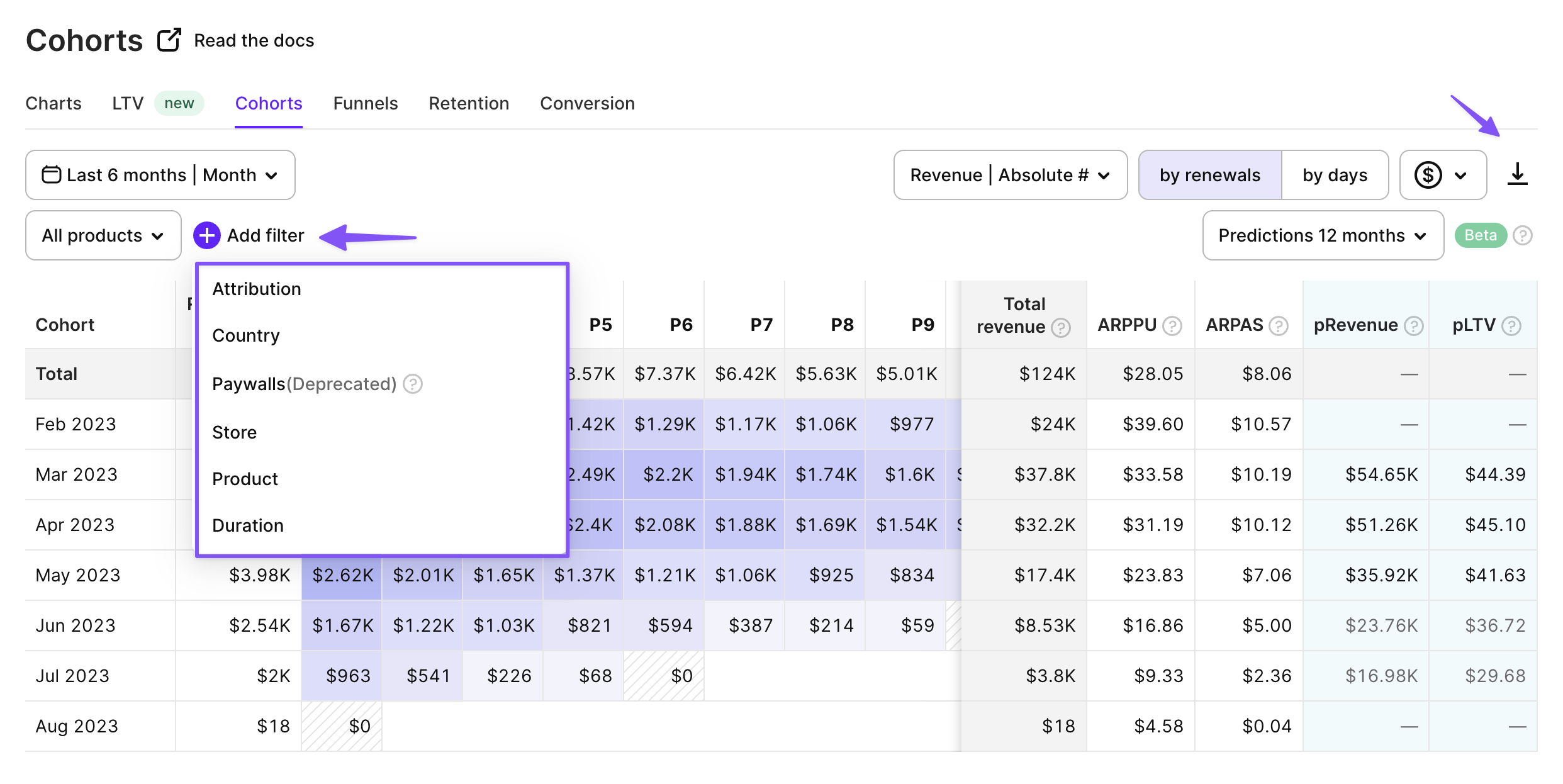
Filters for cohorts analyses
On the right of the control panel, there's a button to export cohort data to CSV. You can then open it in Excel, or Google Sheets, or import it into your own analytical system.
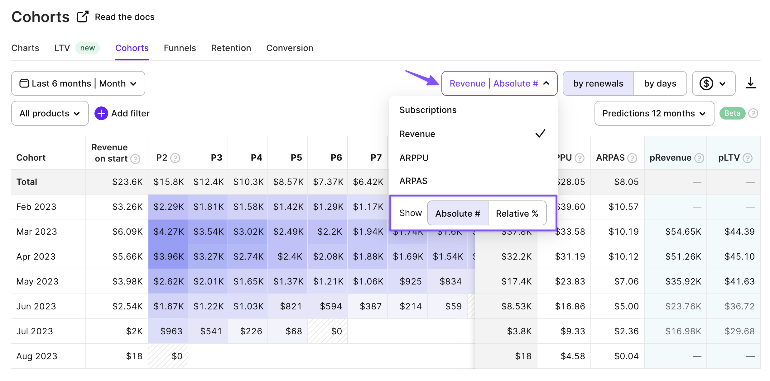
There are 4 metrics that can be shown in cohorts: Subscriptions, Revenue, ARPPU, and ARPAS. You can either display them as absolute values or as a relative change from the start of the cohort.
Metrics for cohorts analyses
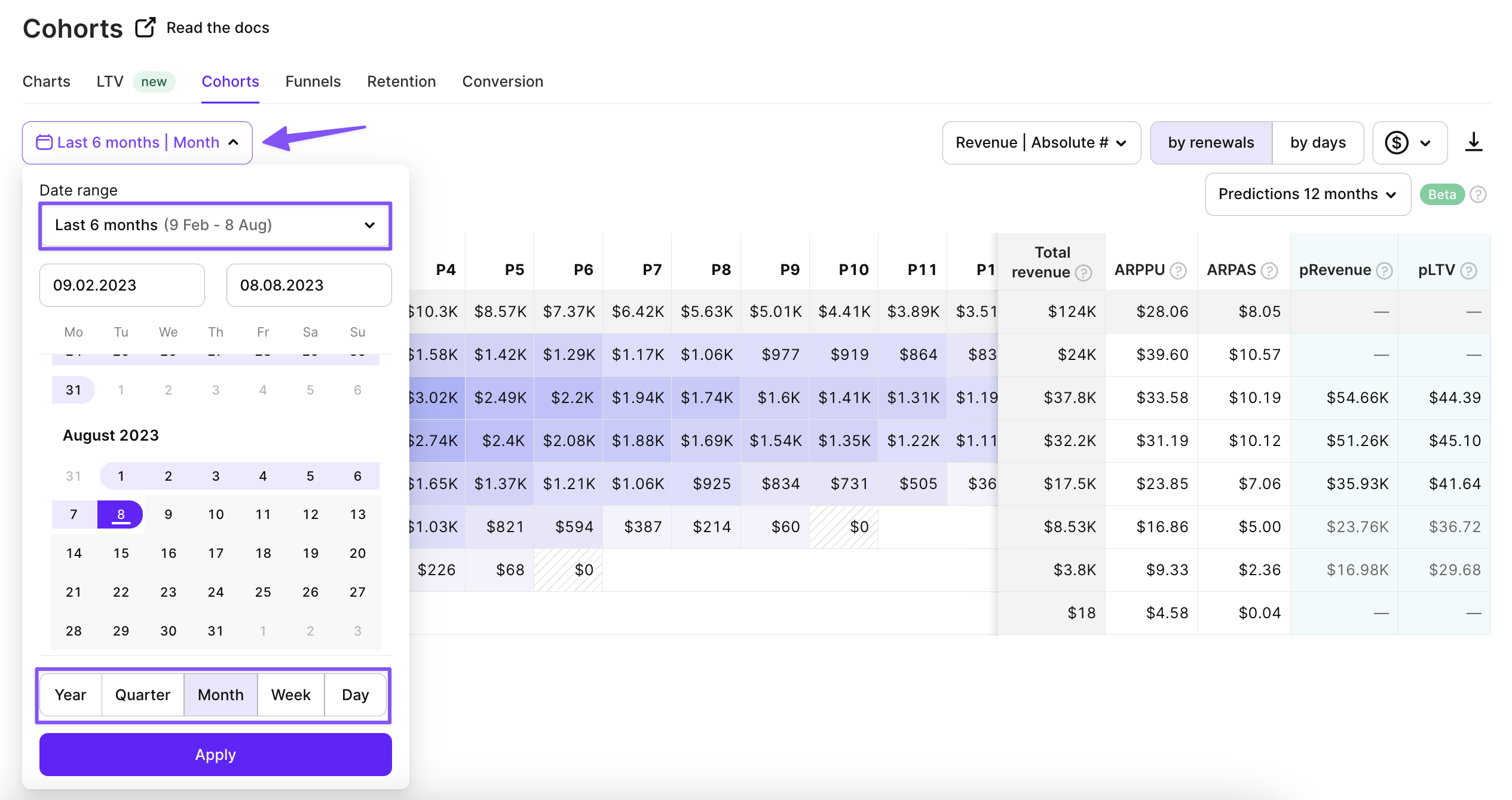
You can set the date range for cohorts and choose the segment. The segment determines a timespan for each row of the cohort.
Date ranges for cohorts analyses
Total revenue, ARPPU and ARPAS
Total revenue is accumulated for a cohort within a selected timeframe (Nov 25, 2022 — May 24, 2023). It helps you to understand how much money you collected from users from a specific cohort and calculate ROAS. For example, if the ad spend for September 2022 was $10000, and the total proceeds for September 2022 cohort are $30000, ROAS=3:1.
ARPPU is the average revenue per paying user. It’s calculated as total revenue / number of unique paying users. $60000 revenue / 1000 paying users = $60 ARPPU. It helps you to understand how much money brings you a paying customer on average.
ARPAS is the average revenue per active subscriber. It’s calculated as total revenue / number of active subscribers. By subscribers, we mean those who activated a trial period or subscription. $60000 revenue / 1500 subscribers = $40 ARPAS.
Commission fees and taxes
One important aspect of revenue calculation in cohorts is the inclusion of store commission fees and taxes (which can vary based on the user's store account country) and store commission fees. Adapty currently supports commission fee and taxes calculation for both App Store and Play Store in cohort analytics.
For more details on how Adapty calculates taxes and commissions in its analytics, please refer to our documentation.
Prediction: pRevenue and pLTV
Predicted revenue (pRevenue) is an estimated total revenue a cohort of paying subscribers is expected to generate within the selected period after cohort creation. It is calculated by multiplying the predicted LTV of the cohort by the predicted number of paying users within the cohort. For example, if the predicted LTV is $50 and there are 100 paying users in a cohort, the Predicted Revenue would be $5,000.
Predicted LTV (Lifetime Value) is the estimated lifetime value per paying subscriber, representing the average revenue each paying subscriber is expected to generate within the selected period after cohort creation.
These predictions are done using machine learning (ML) models, which analyze historical customer data to identify patterns and make predictions about future revenue. For detailed documentation on Adapty's prediction models, please refer to our Prediction documentation.
Adapty cohorts provide detailed insights into user behavior and financial performance within your app. By analyzing cohorts based on renewals or days, you can determine when cohorts become profitable, track revenue, calculate average revenue per user, and understand the time it takes to recoup advertising spend. With customizable filters, metrics, and export options, Adapty empowers you to make data-driven decisions and optimize user acquisition and monetization strategies for maximum app success.
Updated 2 days ago